
Geographic mapping and network analysis of refugee flows in 2015
Due to political, economic and social factors, the refugee crisis in 2015 was severe with the number of refugees and asylum-seekers reaching over 65 million people. As a result of ongoing conflicts in Syria and other parts of the Middle East and Africa, many people were forced to flee their homes. Many of these refugees fled to neighboring countries, while others traveled to more distant destinations in search of safety and security. The refugee crisis in 2015 received significant media attention and resulted in a number of efforts to provide assistance and support to refugees.
We build a visualization of global refugee flows as seen through the eyes of the world’s press, using GDELT (Global Database of Events, Language and Tone) data : “The GDELT project is an initiative to construct a catalog of human societal-scale behavior and beliefs across all countries of the world, connecting every person, organization, location, count, theme, news source, and event across the planet into a single massive network that captures what’s happening around the world, what its context is and who’s involved, and how the world is feeling about it, every single day” (www.gdeltproject.org).
More precisely, the analysis to follow uses data about countries that appear most frequently together in global news coverage of refugees from january 2015 to november 2015. To analyze and visualize flows of refugees, we use the Event Exporter from the GDELT database. To use the Event Exporter a set of criteria is specified for the event type and actors involved, along with a date range. As such the entire GDELT Event Database is searched for all matching entries that are exported as a csv-file. For the current analysis we queried the GDELT Event Database by specifying a date range (start data : 01/01/2015 ; end date : 30/11/2015) and “REF” (refugees) as recipient/victim (actor2) type. The resulting csv-file contains 10.000 records and the layout matches the fields in the GDELT data file description (the data can be dowloaded from my Github repository).
Geographic mapping
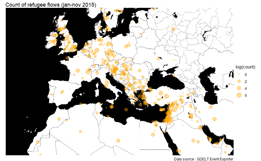
As compared to the period before 2015 where most refugees (originating in Sub-Saharan Africa) reached Europe by crossing the mediterranean sea from Libya to Italy, in 2015 a significant change took place. The majority of refugees coming to Europe crossed the Aegean Sea from Turkey to Greece and subsequently followed their route to the European Union through the Balkans (Slovenia, Croatia and Serbia). The vast majority of refugees originated in the Middle East and came mostly from Syria.
R code
setwd("xxxxx")
events <- read.csv("20151216081931.3377.events.csv",header=T,sep=",")
dim(events)
str(events)
df <- subset(events,select=c("Actor1Name","Actor1Geo_CountryCode",
"Actor2Name","Actor2Geo_CountryCode",
"Actor1Geo_Lat","Actor1Geo_Long",
"Actor2Geo_Lat","Actor2Geo_Long",
"ActionGeo_Lat", "ActionGeo_Long"))
# selection of complete cases (9.445 records remain)
df <- df[complete.cases(df),]
dim(df)
# geographic mapping
# just using the two columns of event location : get the counts for each location
# reshape the data and calculate the number of events for each location
library(plyr)
events$count <- 1
df <- ddply(events,.(ActionGeo_Lat,ActionGeo_Long),summarize,count=sum(count))
library(maptools)
world.map <- readShapePoly("TM_WORLD_BORDERS-0.3")
library(ggplot2)
spdf <- fortify(world.map)
ggplot() +
geom_polygon(data=spdf, aes(x=long,y=lat,group=group)) +
geom_point(data=events,aes(x=ActionGeo_Long, y=ActionGeo_Lat,color="red"),size=0.1) +
theme_void() +
theme(legend.position="none")
pointden <- subset(events,select=c("ActionGeo_Lat","ActionGeo_Long"))
names(pointden) <- c("lat","long")
pointden <- pointden[(!is.na(pointden$lat)),]
pointden <- pointden[(!is.na(pointden$long)),]
library(MASS)
library(viridis)
# get density polygons
dens <- contourLines(
kde2d(pointden$long, pointden$lat,
lims=c(expand_range(range(pointden$long), add=0.5),
expand_range(range(pointden$lat), add=0.5))))
# this will be the color aesthetic mapping
pointden$density <- 0
# density levels go from lowest to highest
for (i in 1:length(dens)) {
tmp <- point.in.polygon(pointden$long, pointden$lat, dens[[i]]$x, dens[[i]]$y)
pointden$density[which(tmp==1)] <- dens[[i]]$level
}
par(mar=c(0,0,0,0))
gg <- ggplot(spdf) + geom_polygon(aes(x=long,y=lat,group=group),fill="gray") +
geom_point(data=pointden, aes(x=long, y=lat, color=density),size=0.3) +
scale_color_viridis() +
ggtitle("Point density news coverage of refugees (jan-nov 2015)") +
labs(caption="Data source : GDELT Event Exporter") +
theme_void() +
coord_equal()
gg

library(ggmap)
lat <- c(20,60)
lon <- c(-25,60)
bb <- c(left=-25, bottom=20,right=60, top=60)
stamen <- get_stamenmap(bbox=bb, zoom = 5, maptype="toner-background")
map <- ggmap(stamen)
map +
geom_point(data=df, aes(x=ActionGeo_Long, y=ActionGeo_Lat, size=log(count)),
col="orange",alpha= .4) +
ggtitle("Count of refugee flows (jan-nov 2015)") +
labs(caption="Data source : GDELT Event Exporter") +
theme_void()
# density analysis
library(maptools)
library(sp)
library(spatstat)
world.map <- world.map[world.map@data$LAT >= 20 & world.map@data$LAT <= 60, ]
world.map <- world.map[world.map@data$LON >= -25 & world.map@data$LON <= 60, ]
SP <- as(world.map, "SpatialPolygons")
W <- as(SP, "owin")
# select the points that lay in shapefile
loc <- data.frame(long=df$ActionGeo_Long,lat=df$ActionGeo_Lat)
loc <- na.omit(loc)
coordinates(loc) <- ~ long + lat
proj4string(world.map) <- "+proj=longlat +datum=WGS84 +no_defs +ellps=WGS84 +towgs84=0,0,0"
proj4string(loc) <- proj4string(world.map)
overlay <- over(loc,world.map)
loc$over <- overlay$NAME
dim(loc)
refugees <- loc[!is.na(loc@data$over),]
world <- fortify(world.map)
ref <- data.frame(refugees)
ref.ppp <- ppp(x=refugees@coords[,1],y=refugees@coords[,2],window=W)
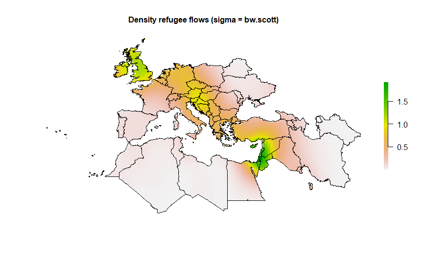
# kernel density (from: Baddeley, A. 2008. Analysing spatial point patterns in R)
# calculate optimal values of bandwidth
bw.diggle(ref.ppp)
bw.ppl(ref.ppp)
bw.scott(ref.ppp)
# plot
jpeg("Kernel_Density.jpeg",2500,2000,res=300)
par(mfrow=c(2,2))
plot(density.ppp(ref.ppp, sigma = bw.diggle(ref.ppp),edge=T),main=paste("h =",round(bw.diggle(ref.ppp),2)))
plot(density.ppp(ref.ppp, sigma = bw.ppl(ref.ppp),edge=T),main=paste("h =",round(bw.ppl(ref.ppp),2)))
plot(density.ppp(ref.ppp, sigma = bw.scott(ref.ppp)[2],edge=T),main=paste("h =",round(bw.scott(ref.ppp)[2],2)))
plot(density.ppp(ref.ppp, sigma = bw.scott(ref.ppp)[1],edge=T),main=paste("h =",round(bw.scott(ref.ppp)[1],2)))
dev.off()
density <- density.ppp(ref.ppp, sigma = bw.scott(ref.ppp)[2],edge=T,main=paste("h =",round(bw.scott(ref.ppp)[2],2)))
plot(density)
library(raster)
density.raster <- raster(density)
projection(density.raster) <- projection(world.map)
plot(density.raster)
d1 <- crop(density.raster,extent(world.map))
d2 <- mask(d1,world.map)
par(bty = 'n')
plot(d2,main="Density refugee flows (sigma = bw.scott)", cex.main=1, axes=FALSE)
plot(world.map,add=TRUE,lwd=1)
2. Network analysis
For the network analysis, we first preprocessed the data and selected records with a different country code for both actors and further restricted the analysis to refugees or asylum seekers for the second actor. While the focus in the preceeding analysis was on the European continent, in the network analysis to follow all links between countries are considered.
R code
# selection records with Actor1CountryCode < > Actor2CountryCode (3.311 records remain)
a <- paste0(df[,2])
b <- paste0(df[,4])
df <- df[!a==b,]
# selection of Actor2Name = "REFUGEE" or "ASYLUM SEEKER" (1.898 records finally remain)
df <- subset(df,df$Actor2Name == "REFUGEE" | df$Actor2Name == "ASYLUM SEEKER")
# aggregation
df$count <- 1
df <- ddply(df,.(Actor1Geo_CountryCode,Actor2Geo_CountryCode,Actor1Geo_Lat,Actor1Geo_Long,
Actor2Geo_Lat,Actor2Geo_Long),summarize,count=sum(count))
library(igraph)
network <- graph.data.frame(df,directed=F)
V(network)$size <- log1p(degree(network))
V(network)$lab <- log1p(degree(network))
E(network)$weight <- runif(ecount(network))
E(network)$color <- ifelse(E(network)$favorited==TRUE,"greenyellow","lightcoral")
par(mar=c(0,0,1,0))
plot(network,main="Network refugees 2015 GDELT Event Exporter jan-nov 2015",cex.main=1,
edge.curved=TRUE,
edge.arrow.size=0.4,
edge.arrow.width=0.4,
vertex.label.dist=0.5,
vertex.frame.color="blue",
vertex.label.color="black",
vertex.label.font=2,
vertex.label=V(network)$name,
vertex.label.cex=1)
dev.off()
bad.vs <- V(network)[degree(network) < 18]
network <- delete.vertices(network,bad.vs)
write.graph(network,”network.graphml”, format=”graphml”)
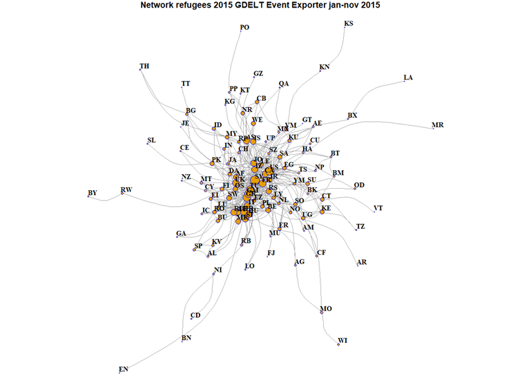
The network above shows that the co-occurrence of links between countries (in the center of the network graph) is strong which means that there is a frequent flow of refugees between these countries. Other countries are less frequently mentioned together. Therefore, we excluded nodes (countries) with a low degree : nodes with a number of adjacent edges lower than the mean were dropped from the analysis. The (reduced) network (igraph object) is exported into a graphml file (with 26 actors or nodes/vertices and 640 relations/edges) that can be visualized with Gephi.
Gephi is an open software for graph and network analysis (https://gephi.org ). We used version 0.8.2 of Gephi and imported the graphml file as an undirected graph. First, we used the modularity statistic. This algorithm attempts to find clusters by identifying components that are highly interconnected. Based on the modularity class we partitioned the dataset and color-coded the countries that co-occur more frequently with each other than with other countries. In this way we could cluster the dataset in two groups (communities) of countries. To determine the layout of the network, we applied the Fruchterman-Reingold method. This technique uses the ideas of attraction and repulsion to place nodes on the graph. Finally, we sized the nodes by calculating eigenvector centrality, a measure of how important a node in a network is (network importance).

The network reflects which countries are mentioned together in news coverage of refugees. While the mainstream vision is that the refugee crisis of 2015 finds its endpoint in Europe, the above network diagram based on GDELT data suggests that trajectories of refugees also differ from this vision. As the thickness of the edges is proportional to the number of displaced persons between countries, we can see that the link between Syria and the United States is most visible, followed by the (well known) displacements of Syrian refugees to Turkey.